How to Brand SharePoint Navigation

SharePoint is a great tool with seemingly endless uses. From intranet solution to public facing website, SharePoint has many functions and is used for various purposes. How SharePoint looks out of the box, however, is not necessarily pretty. If you want to create a better user experience on your SharePoint site, a great way to start is by branding different elements that your users interact with frequently. In this tutorial, I'll show you how to brand SharePoint's the out-of-the-box navigation.
The out-of-the-box navigation leaves a lot to be desired. Here is an example of what SharePoint navigation looks like without any styling:
 The dropdown in the out-of-the-box navigation looks like this:

With a few minor tweaks to the master page and some CSS edits, I'm going to show you how to style the SharePoint navigation to have a more sleek design and friendly user experience.
Before we begin...
This quick how-to guide will assume that you are familiar with a few things. Though you may not be an expert at these things, they will serve as foundational steps when embarking into the world of SharePoint branding and design. Here are some of the basics to be familiar with:
- Editing Master Pages
- Attaching CSS files to Master Pages
- Editing/Adding CSS to your custom file
1. Adding the Publishing Navigation
First we need to prepare our Master Page for everything we’re planning to do. In this how-to, we are going to use a modified Seattle Master Page that uses a Publishing Navigation. In order to do this, we must add the Publishing Navigation tag prefix to the header of the Master Page. You’ll see a few of these, or depending on which Master Page you’re using, you’ll see quite a few. The tags start like this:
<%@ Register Tagprefix
The tag you will need for the Publishing Navigation is as follows:
<%@Register TagPrefix="PublishingNavigation" Namespace="Microsoft.SharePoint.Publishing.Navigation" Assembly="Microsoft.SharePoint.Publishing, Version=15.0.0.0, Culture=neutral, PublicKeyToken=71e9bce111e9429c"%>
Simply copy and paste that on a new line under the existing Tags.
2. Adding your custom CSS file
There are a few different ways that you can attach your custom CSS file to a Master Page. The method I chose to use is just the standard HTML linking procedure. Always make sure that you’re linking your file within the <head> tags and not outside of the closing </head> tag. Here is the example HTML to link your css file:
<link rel="stylesheet" type="text/css" href="/Style Library/css/styles.css">
You can see in the example that it is assuming that your CSS file is in the ROOT directory and inside the Style Library folder, and within a CSS folder inside of that.
3. Adding Google's Material Design Font Icon
In this how-to, we’re also using Google’s Material Design icons to replace the default SharePoint down arrow that indicates if a link has sub navigation (children) or not. For this, all you need to add is a link that Google provides on their CDN (Content Delivery Network). Paste this link code underneath our styles.css link:
<link href="https://fonts.googleapis.com/icon?family=Material+Icons" rel="stylesheet">
Later, in the CSS code that will be provided, you will see where this comes into play.
4. Adding the Publishing Navigation
Inside our Master Page (we’re using a modified Seattle Master Page), you should be able to locate a snippet of code with the ID “DeltaTopNavigation”.
<SharePoint:AjaxDelta id="DeltaTopNavigation" BlockElement="true" CssClass="ms-displayInline ms-core-navigation" role="navigation" runat="server">
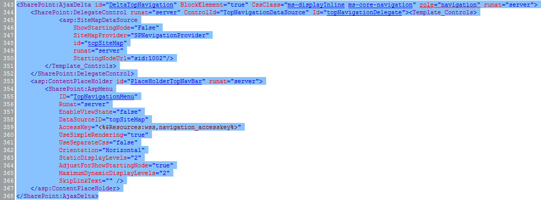
Make sure that you select the whole SharePoint control:

Delete that selection, and then replace it with this snippet of new code:
<!--Main Nav-->
<div id="nav" class="nav-wrap">
<PublishingNavigation:PortalSiteMapDataSource ID="topSiteMap" runat="server" EnableViewState="false" SiteMapProvider="GlobalNavigationSwitchableProvider" StartFromCurrentNode="true" StartingNodeOffset="0" ShowStartingNode="false" TrimNonCurrentTypes="Heading"/>
<SharePoint:AspMenu ID="TopNavigationMenu" runat="server" EnableViewState="false" DataSourceID="topSiteMap" AccessKey="<%$Resources:wss,navigation_accesskey%>" UseSimpleRendering="true" UseSeparateCss="false" Orientation="Horizontal" StaticDisplayLevels="1" AdjustForShowStartingNode="true" MaximumDynamicDisplayLevels="1" SkipLinkText=""/>
</div>
<!--/Main Nav-->
Notice that we wrap our new SharePoint navigation control in a DIV with the ID of “nav”. This will come in handy during the CSS portion and allow us to target elements in the navigation more easily, without affecting anything else that may or may not contain certain CSS selectors for that specific element.
That’s it for the Master Page! Save all the changes we’ve just done, and then move on to the next part where we’ll add the CSS.
5. Adding CSS to your Custom CSS File
Earlier we linked our custom CSS file to our Master Page. Make sure that the styles.css file exists in the correct directory. The file structure should look something like this:

Open the styles.css and paste the following section of CSS into the file:
/*============================*/
/* Navigation
/*============================*/
/*Nav Styles*/
#nav { border-bottom: 1px solid #e1e1e1; border-top: 1px solid #e1e1e1; list-style: none; margin-top: 8px; margin: 10px 0; position: relative; text-align: center; width: 100%; z-index: 5; }
#nav li { font-size: 14px; height: 65px; line-height: 65px; position: relative; }
#nav li a { border-top: 4px solid transparent; color: #909090; display: block; font-weight: normal; margin: 0; padding: 0 10px; text-decoration: none; }
#nav li a:hover { border-top: 4px solid #0072C6; }
/*Sub Nav Arrow Indicator - Replacement Using Google Material Design Icons*/
.ms-core-listMenu-horizontalBox .dynamic-children.additional-background { background-image: none; padding-right: 15px; position: relative; }
.ms-core-listMenu-horizontalBox .dynamic-children.additional-background:after { content: '\E313'; display: inline-block; font-family: "Material Icons"; font-size: 16px; margin-top: 0px; position: absolute; right: -5px }
/*Sub Nav Styles*/
#nav ul.dynamic { background: #fff; border: 1px solid #e8e8e8; border-top: 2px solid #0072C6; box-shadow: 1px 5px 0px rgba(0, 0, 0, 0.07); left: -9999px !important; list-style-type: none; min-width: 215px; opacity: 0; padding: 0; position: absolute; text-align: left; top: 65px; z-index: 100; transition: opacity .40s ease-in-out; -moz-transition: opacity .40s ease-in-out; -webkit-transition: opacity .40s ease-in-out; }
#nav li.dynamic-children.hover ul { display: block; left: 0 !important; opacity: 1; top: 65px !important; }
#nav li.dynamic-children:hover > a { border-top: 4px solid #0072C6; }
/* This makes sure the border-top stays on the parent element when hovering the submenu */
#nav li.dynamic-children ul li { height: 35px; line-height:35px; width: 100%; border-bottom:1px solid #d1d1d1; }
#nav li.dynamic-children:hover > a.static.selected { background: #fff !important; color: #222; }
#nav li.dynamic-children ul a { border: 0; padding: 0 10px; width: 100%; }
#nav li.dynamic-children ul a:hover { background-color: #f1f1f1; }
6. Wrap it All Up
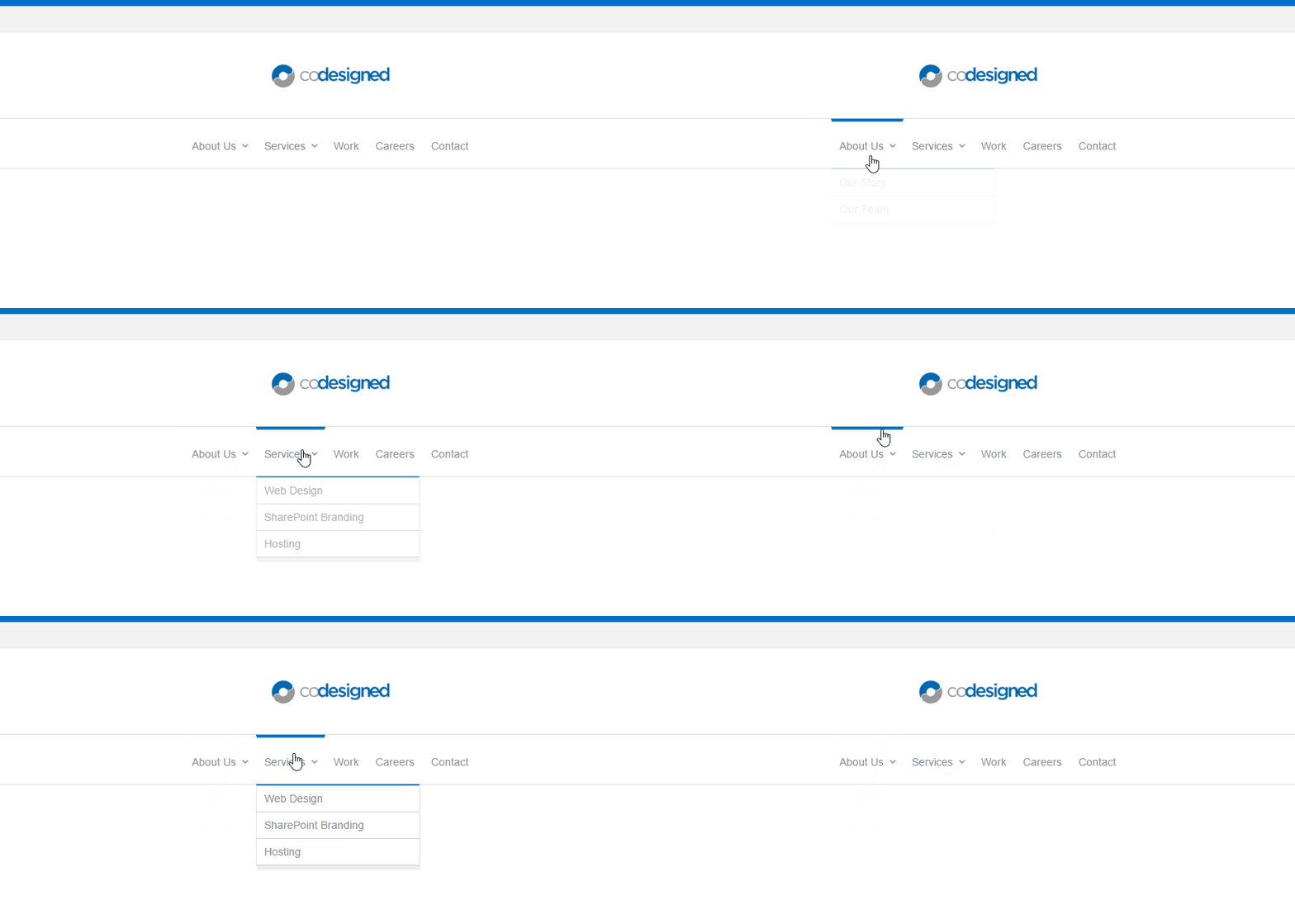
If everything has gone according to plan, you should see the results as soon as you save your CSS file.
Here is what the final, styled navigation looks like on my Master Page:

A few considerations...
The provided CSS will only really work with navigations using a maximum of 1 display level (You can see this in the provided Publishing Navigation snippet above). Down the road if you decide that your navigation will have another level of display, the code is robust enough to work quite well with a few alterations.
Thanks for joining me! Stay tuned for more of my SharePoint branding posts, and leave me a message in the comments about any SharePoint branding tips you'd like to see featured next!
For more tips and tricks like this, check out our SharePoint design blogs. Discuss ways to create your own custom designed SharePoint intranet by talking to one of our consultants today!
